Standard and Poor’s Case-Shiller index was released today with disappointing indications of a double-dip recession, at least for the housing market. This provided an excellent opportunity to visualize the data they make public.
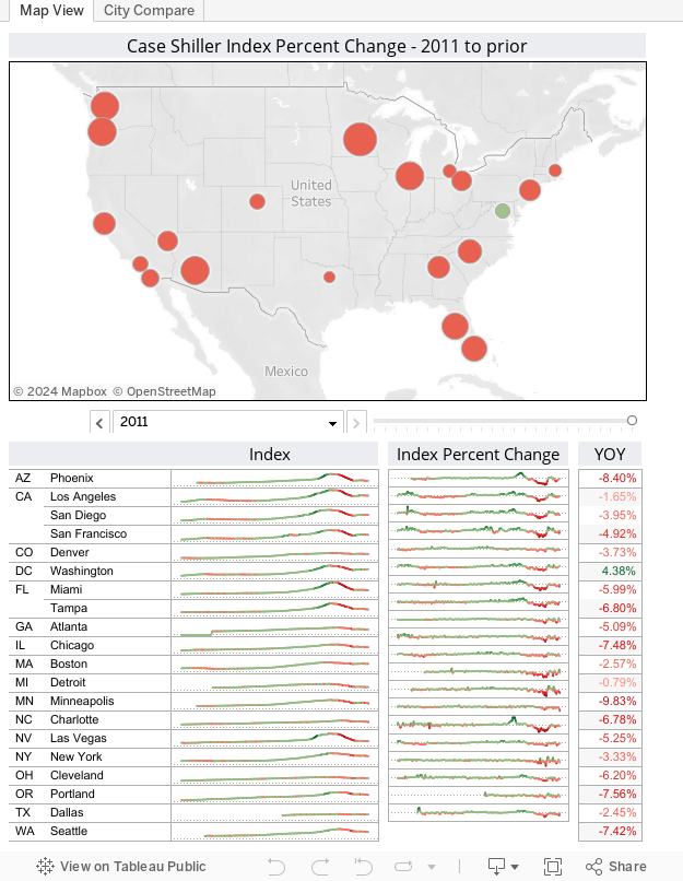
Below is the seasonally adjusted data for March 2011, going back over two decades. The index is set so that all cities (regardless of median selling price) are indexed at 100 for the year 2000. There are two tabs on the visualization.
The first shows the location of the 20 metropolitan areas covered by the index with marks encoded for size by the absolute percent change of the index from the year prior, and color by the magnitude of the change (big green = big increase from last year in house prices, big red = big decrease from last year). Use page control to cycle through the years looking at the booms and busts. The sparklines below show the index and the percent change month to month, also encoded by color.You can click on a city on the map and it will filter the sparklines to cities in that region. The year on year value compares values from March 2011 to March 2010. Note the only bright spot of Washington D.C. with a positive gain. Detroit is interesting with one of the smallest decreases – sign of a recovery or that prices just can’t fall any more?
On the second tab are the indexes, and Year on Year charts with all of the cities overlaid. Select a city from the list to highlight it. There are some interesting things here such as Dallas which has had a very shallow change. Compare that to Las Vegas or Phoenix. Unsurprisingly, those that rose the fastest dropped the most.